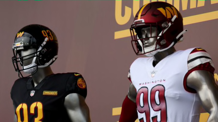
After Wednesday’s rebrand, the Washington Commanders have a new name and new uniforms, to go with a new-look logo and team crest.
With social media being an inevitable part of the reveal process, the rebrand was always going to draw mixed reviews from fans. Some have taken an open-minded approach, while others are reluctant to accept the team’s new identity.
The Commanders moniker has been critiqued through and through, so we won’t go down that rabbit hole.
Instead, let’s discuss the uniforms and new “W” logo.
By and large, the new home look was well-received. The top-to-bottom burgundy design was a great idea and the matte helmet is a 10/10. The black alternative was well done, too, as it jives perfectly with the gold numbers, and the burgundy and gold DC flag patch on the right shoulder is extremely cool.
While those uniforms figure to be big-time sellers, fans are still warming up to the road whites and “W” logo. How pronounced is the outrage? Let’s just say a couple of diehards took it upon themselves to come up with a new look.
I like the one on the left. … https://t.co/3Y9zPTJ2Uw
— John Keim (@john_keim) February 3, 2022
The Commanders should consider these fan edits to fix their new road uniform and “W” logo.
Look, we admire Washington’s desire to welcome a new era of football with an entirely new uniform set. As much as the home and alternative jerseys are being raved about, the road whites are getting slammed, and rightly so.
It seems like they tried to do too much. The decision to abandon the franchise’s familiar Burgundy and Gold look is the biggest problem. In the fan edit, that color scheme returns and it’s markedly more perceptible.
Instead of a red, white and black (?) pattern around the shoulders, you get a much more appropriate Burgundy and Gold.
Simply put, the design on the left looks like a uniform worthy of the Washington Commanders. The one on the right, however, looks like it’d better suit the Atlanta Falcons or Arizona Cardinals. Yes, that comparison has been regurgitated countless times the last few days, but that’s because it’s spot-on.
There’s nothing wrong with owning up to a mistake and Jason Wright and Co. should seriously consider reaching out to the fan(s) responsible for this edit. It’s only February. Get ahead of this before it’s too late.
As for the logo, here’s what Reddit came up with.
Found this on Reddit. Actually like it. Adds a little more DC related detail. Could also easily be added. pic.twitter.com/QqW56t7XP8
— Eric Sully (@CommandersRealm) February 4, 2022
After 18 months of anticipation, we were a little disappointed with the logo. While we applaud the decision to keep the Football Team’s “W” as the main attraction, the new one had a few lines added to it for whatever reason. Sorry, but we disagree with the press release that called the letter “powerful.”
We would’ve like to see more creativity, like the above edit, which wisely removed the additional lines and injected some DC flavor with the three stars. Not a complete facelift. Just a simple tweak that goes a long way.
The Commanders wanted fans input about a new nickname. Why not do the same with the uniforms? The logo edit might be a tall ask, but altering the white to better represent the team’s history seems reasonable.
Make it happen. Don’t let prides and egos get in the way here.
