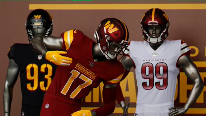
1. New helmet and uniforms
They’re not perfect, but Washington fans should definitely feel some level of satisfied with the new uniform set.
It’s a pack of three. Yes, Washington now (hopefully) has a consistent alternative look to rock through the course of a season. The home jersey consists of the familiar burgundy and gold coloring pattern. The gold trim near the shoulder pads is a great touch and really helps complete the look.
These might be the consensus fan favorite to start, as it sticks to the organization’s roots and extensive history. The red, matte-laced helmets are a thing of beauty. They even make the panned new “W” logo look presentable.
Forever a tradition: Burgundy & Gold pic.twitter.com/RSNEx96TI5
— Washington Commanders (@Commanders) February 2, 2022
Moving on two the road whites. We’re still working on talking ourselves into them. They just give off a huge Falcons and Cardinals vibe. Why abandon the normal color scheme? Washington’s the Burgundy and Gold. Not Burgundy and Red.
Perhaps it’ll look better on the players than it did on the mannequins, but we get the sense the new red is going to stick out like a sore thumb.
https://twitter.com/Commanders/status/1488874954707939333
Last, but certainly not least, is the black alternates. The leaked copies of this set looked rough at first, but the real-life version is incredibly appealing. The only complaint we have is that the “W” logo looks out of place on the front of the helmet, but the letters are gorgeous, as is the burgundy and gold crest on the shoulder pad.
Burgundy & Gold x Black & Bold pic.twitter.com/P8vZAoAEJD
— Washington Commanders (@Commanders) February 2, 2022
Can you imagine how pretty these would look under the lights in primetime? That’s definitely on the way-too-early bucket list for 2022. Either way, Washington finally having a regular alternative jersey is truly an underrated perk of the rebrand.
Don’t let it go unnoticed!
We obviously don’t expect everyone to like them, but we’re trying to keep an open mind and it’s not like they’re repulsive. Take a look around the league and try to name 10 teams with a more unique uniform set.
Between the riveting hype video, doing right by former greats that have passed through the organization and having them on hand at FedEx Field and unveiling a mostly-engaging uniform set, how can you not draw the conclusion that the Washington Commanders’ rebrand was a success?
Not a smashing success, but a success, and that alone is significant.
